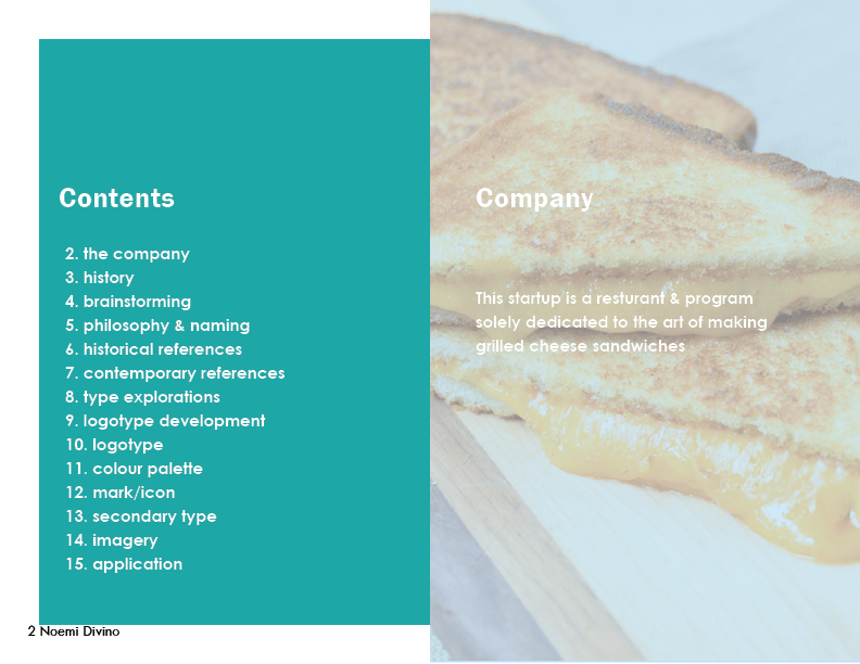
A resturant and program to showcase
the art of making grilled cheese.
This is the capstone project for the non-credited Graphic Design Specialization by California Institute of the Arts on Coursera. This project required us to make up a start-up company and create a brand development guide for this startup company . The goal of this project was to apply what we had learned throughout the specialization and create a brand identity for our company. Completed July 8, 2020. Below is my final project, please keep in mind I’m still learning on how to describe design in a professional way.
Ver Cheesy
My love for grilled cheese sandwiches and finding a great grilled cheese sandwich in restaurants led me to create a start-up restaurant that also has a program that allows you to make the perfect grilled cheese sandwich for yourself.
Tools Used:
Adobe InDesign
Adobe Illustrator
Adobe Photoshop
Week 1
During the first week we were asked to create 5 things:
- a sentence describing what our startup is
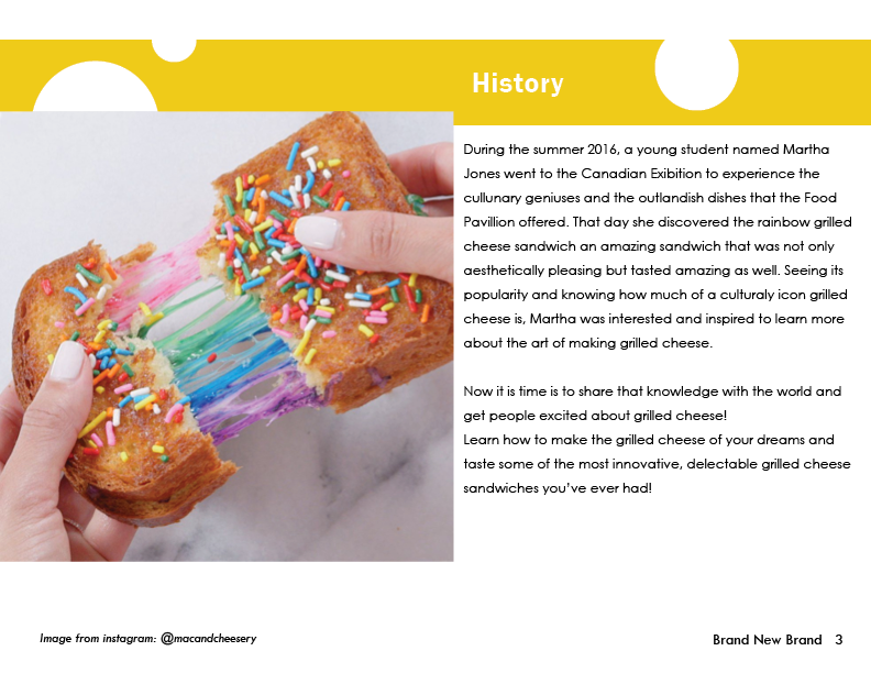
- the history of the startup
- a mind map highlighting adjectives that our startup could have
- list three adjectives from the mind map that would be the company’s philosophy
- three potential names and highlight the name you would go with


Week 2
During this week we were asked to obtain historical and contemporary images that we could use for reference when creating the image of the company.
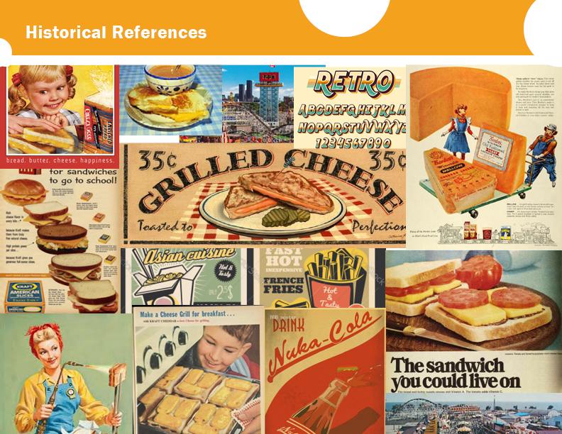
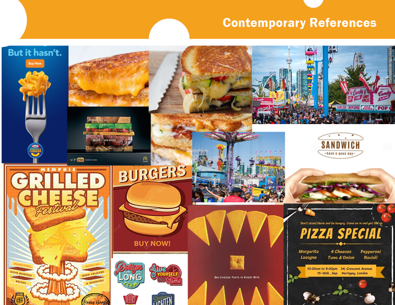
I chose to have both the historical references and the contemporary images center around cheese, specifically the colour of cheese (yellow-orange). In addition to the depictions of products with cheese I added references to the Canadian National Exhibition (CNE) to suit the history of the company and add a playfulness to the references.
Week 3
This week called for the focus on exploring different typefaces and creating a logotype
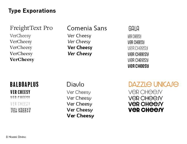

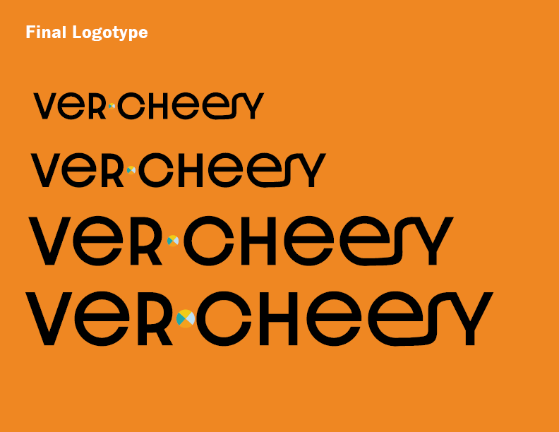
I decided to go with Dazzle Unicase for the logo’s typeface because it is a sans serif font, giving it a modern look. In addition, the “s” letter shape provides that slick feeling to the logotype, which is fitting for the word “cheesy”.
Week 4
During this week were asked to create 5 things:
- a colour palette and how that colour palette would look with our logotype
- a mark/icon for the company
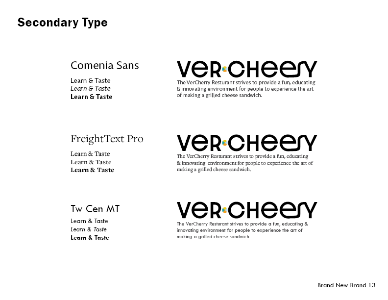
- secondary typeface(s)
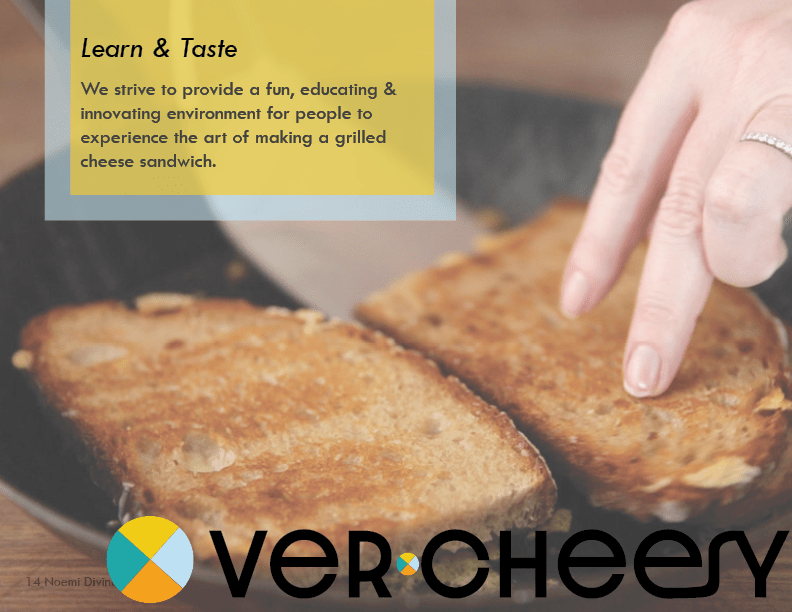
- an imagery to showcase what you would want the company to look like
- a secret ingredient to make your brand more interesting
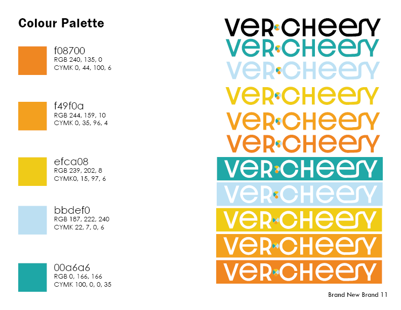
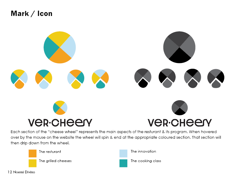
The aim of the colour palette was to remind the audience of cheese with the three different warm colours, as well as a fun yet modern twist to it using the cool colours. My secret ingredient was the logo itself, since each colour had a specific meaning to it and would melt or drip down from the logo if it were a motion graphic.
Week 5
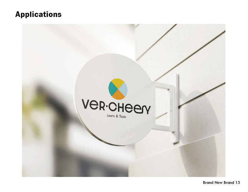
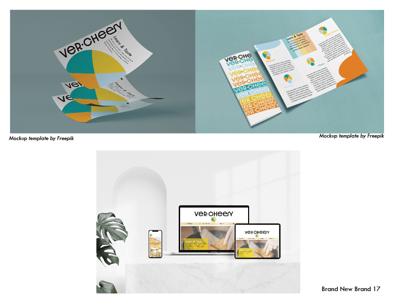
The final major component to this brand development guide was to apply our brand and provide minimum of 4 mock-ups.

Week 6
The final part to this brand development guide was to add a cover and back page to our guide.

